2020-08-08 【Aiden in English】
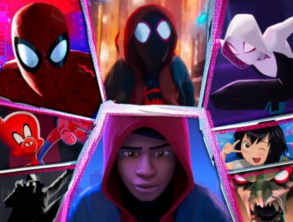
Spiderman: Into the Spider-Verse is a relatively recent big-screen animated Marvel film that introduces many new characters from numerous dimensions derived from multiple comic book series. From the classic Peter Parker to a slightly more vaccinated Peter Porker, the wide range of loosely based spider (and another animal) heroes band together with the main protagonist and freshly bitten Miles Morales to take on evil in the most flashy, comedic 1990s style possible. Although the movie is almost two years old, I only recently watched the entire work via HBO's free quarantine access. It's not often that I come across films where the storyline isn't the main takeaway. Still, for this particular case, I walked away from this movie enjoying the plot and characters, most of all appreciating its detail and design. Animated projects from large studios over the past decade have featured smooth animation and picturesque artwork. Still, Spiderman: Into the Spider-Verse creates grand, colorful displays I find unparalleled by other movies. Whether it be whips of orange and red trees against a snow-covered forest floor or bright neon lights scattered across a midnight sky, each scene's beautifully crafted features engrain the story's acts in your mind. As I recall the entirety of the film, the drastic contrasts between setting colors symbolize the progression in Miles Morales' journey to becoming the ultimate Spiderman of his dimension. Beginning at rock bottom, he opens his superhero adventure with an escape through a chaotic red and orange swirling forest; gradually adapting to his mentor and companions, the movie shifts to another chaotic tussle in a cramped suburban house; finally, with Miles taking a leap of faith, the setting switches to a cool, calm black—the color of his suit. In a character-defining section of the film, a swell of heart-pumping music and a scene of impeccable artistry build the awe-inspiring cinematic spectacle of Miles Morales confidently backflipping off a glass high-rise into the glowing skyline of New York City below. Spiderman: Into the Spider-Verse creates momentum like no other movie. I was satisfied with a wholesome, creative masterpiece, but my mind held a lingering curiosity. After finishing the fantastic hour and fifty-six-minute runtime, I researched a bit deeper on the animation to confirm this notion. As I hesitantly noticed in the first screening, Miles Morales, the newly bitten Spiderman, is indeed animated for the first two-thirds of the movie in twelve frames per second. In comparison, almost everything around him is drawn in a smoother twenty-four frames per second. In other words, Miles Morales appears jittery and unstable in his early outings, even when he's not in his suit. He hasn't found his purpose in life, is embarrassed by an outgoing father, and is struggling to juggle his new school courses. In his first attempts at superhero-ing, he clumsily trips over ledges and crashes into trees like an infant raccoon on ice skates. However, when Miles makes that leap off the skyscraper, and Black Caviar's "What's Up Danger" drowns out everything else, there is a distinct moment—a transformation of both animation and character— where Miles enters the world of twenty-four frames-per-second. His moves suddenly gain fluidity and grace, and syncing with the blood-racing excitement of the sound, the movie achieves a momentous climax that I realized I couldn't find in any other kids' or superhero film (yes, including Avengers: Endgame). Implementing such creative techniques, the producers and animators weave together this wondrous artwork—a masterpiece of character and story building that concludes in a manner that leaves me cheering on a fictional teenager in a fictitious universe of Spidermen and arachnid piglets. 【红霞译】
《蜘蛛侠:平行宇宙》是漫威动画公司近期发行的电影,片中引入了不少漫画丛书中出现的角色,从经典古朴的彼得·帕克到稍微油头滑脑的彼得·帕克,形形色色的蜘蛛(还有另外一种动物)英雄无所不用其极地将剧中主角且刚被咬伤的迈尔斯·莫拉莱斯塑造成上个世纪九十年代最招摇、最幽默的除恶翻版。
尽管电影已公映快两年,但直到最近美国家庭电影台为冠状肺炎病毒防疫豁免收看费用,我才得以看完这部作品。平常我浏览的片子大多口碑极佳,但这回我却偏爱剧情与角色,最重要的在于我更欣赏它的丰富细节与设计理念。过去十年间,大型影业制作的动漫片都讲究动画流畅性和艺术诗画观,而《蜘蛛侠:平行宇宙》恢弘绚丽,无论是雪地上橙红色森林,还是夜空中霓虹灯闪烁,各个精心打造的故事场景无不铭刻在观众脑海之中。当我回忆起整部影片,每处拍摄场景颜色之间的强烈对比都象征了迈尔斯·莫拉莱斯变成终极蜘蛛侠的发展过程。故事开头,描述他是从逃离一片战混乱弥漫的橙红色森林开始了超级英雄冒险之旅;镜头逐渐转向他的导师和同伴,在郊外狭窄陋屋里出现另一场争斗;最终,蜘蛛侠放手一搏,场景呈现冷静、沉稳的黑色,也就是身上穿的西装颜色。在诠释角色部分中,大量撼人心魂的音乐旋律和无可挑剔的艺术场面营造出不同凡响的视觉奇观,蜘蛛侠自信地向后空翻,离开了掩映在纽约天际线下光鲜的玻璃摩天大楼。
《蜘蛛侠:平行宇宙》独辟蹊径,很高兴看到这样一部极富创作性的杰作问世,但我心存好奇,一个小时五十六分钟激动过后,为确认播放速度,我对动画部分进行了更深入研究。第一幕:迈尔斯·莫拉莱斯即刚被咬伤的蜘蛛侠,我慢慢地注意到三分之二的电影画面数均为12帧/秒,而几乎所有与他有关的镜头则采用更加流畅的24帧/秒刷新率,换句话说,前期出现的蜘蛛侠即使没穿制服,依旧紧张多变,外向老爸让他难堪,新课程也得加劲适应,而且尚未找到属于自己的人生目标。在第一次尝试超级英雄时,他像溜冰的小浣熊一样,笨手笨脚翻过窗台撞到了树上。 然而,当蜘蛛侠跃上摩天大楼时,黑鱼子酱演唱的《当心危险》声起,盖过周围一切,特立独行的时刻到了—动漫与角色转换—蜘蛛侠进入24帧/秒画面,他的一举一动突然变得流畅潇洒,让热血情感找到了共鸣,由此将剧情推向高潮,我意识到没有哪部儿童或超英电影能像《蜘蛛侠:平行宇宙》再次刷新世界观(没错,包括《复仇者联盟4:结局之战》)。运用创新技术,制片人与动画师联手开创了抽帧卡点的先河,优秀艺术作品离不开丰满的角色与奇妙的故事,最后我发现自己禁不住为蜘蛛侠们和拟人蛛—蜘猪侠终极世界中的虚构少年拍手称道。 Today in History(历史上的今天): 2014: Punchliner on Carnival(嘉年华·妙语连珠)

Crosslinks(相关博文): 11th Grade Film Criticism—Character Movies(影评—角色电影) 11th Grade Book Review─Freakonomics(书评─浅议《魔鬼经济学》)
7th Grade Book Review─Thank You M'am(书评─《谢谢您,夫人》) 6th Grade Book Review─Head above Water(书评《浮出水面》) 6th Grade Book Review─Urban Outlaws(书评─浅议《城市水浒传》) 11th Grade(高中三年级) |
